“Life is too short to live in black and white.”
That’s the message that leading American paint company Benjamin Moore transmitted in unveiling its latest “color of the year” – Raspberry Blush – a vibrant orange-red shade that projects joy, warmth and charisma. It’s a stark contrast to the more muted tones that characterized the company’s selection over the past decade and especially last year’s inescapable gray that felt like a thick fog, seeping into every corner of our lives.
We at A.I. Labs are sensing a similar shift in sentiment across a wide range of sectors and modalities. People are ready to give up the safety and comfort of backdrop colors in favor of bolder, brighter opportunities.
1| THE EVOLUTION OF A TREND
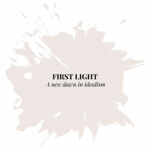
Color of the Year (2020): First Light was a soft, rosy hue that felt subtle, elegant and nature-inspired. (It actually was the first time Benjamin Moore ever had picked a pink hue as its color of the year.) The shade reflected a new beginning and, in particular, a new definition of home, best expressed by the trend in open and flexible Scandinavian-influenced designs.
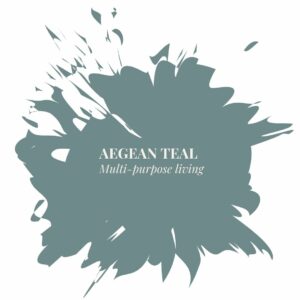
Color of the Year (2021): Aegean Teal spoke to a world in transition — one that was still grappling with the protracted effects of Covid. Touted for its balance and adaptability, the blue-green-gray color supported our effort to rework our home spaces for multi-purpose living.
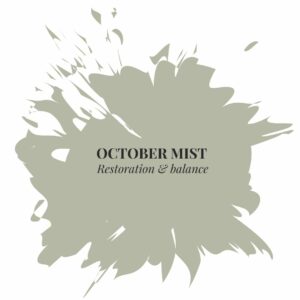
Color of the Year (2022): October Mist, a subtly neutral shade, soothed us during a particularly tumultuous political period. Its dustiness elicited feelings of restoration and calm. It also was said to spur growth and creativity (as described in our earlier newsletter).
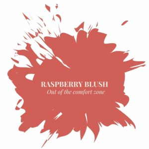
Color of the Year (2023): Raspberry Blush is a bold and confident coral shade that “enlivens the senses.” Its vibrancy commands attention and energizes its surrounding environment. According to Andrea Magno, head of Benjamin Moore’s color marketing, even the experts had to push themselves beyond their comfort zone in choosing this latest shade.
2| EMBOLDENING OUR LIVES THROUGH COLORS
As this year’s palette (shown below) demonstrates, even the boldest colors can mesh well together! Shades like terra-cotta of Cinnamon help reel in Raspberry Blush. The palette was inspired by the bold strokes of modern art and the collective urge to re-express ourselves.
As the trend in maximalist style takes hold and color confidence grows, People are ready to give up the safety and comfort of backdrop colors in favor of bolder, brighter opportunities. We encourage you to set aside the “chromophobia” that may linger and embrace the language of color. In our most recent post, we share a few taste hacks to better understand and leverage the effects of color. 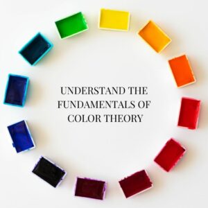
Start by familiarizing yourself with with the color wheel. In a nutshell, there are four main qualities to colors (hue, saturation, value and temperature), each of which have their own distinct effect on how we feel and behave.
Every color has its own personality. So, before selecting colors for your walls or wardrobe, identify what exactly you wish to express. Then, figure out how best to convey that story through your choice of colors.
To delve deeper, see our past newsletter on the topic.
3| PAIRING VISUAL CUES WITH OTHER SENSORY STIMULI
In celebration of this year’s color selection, Benjamin Moore enlisted electro-funk duo Chromeo to riff on what this color might look like in song form. You can listen to Chromeo’s song “Raspberry Blush” above and explore other playlists inspired by Benjamin Moore’s 2023 palette.
While only 1 in 3000 people have chromesthesia (a form of synesthesia that enables them to hear hues), you still can learn to pair colors with other forms of sensory stimuli like music. Try it. As you’ll see, it not only will reinforce the mood you’re trying to set, but also can enhance it.